Amplify Your Print and Digital Presence
I'm Jade, I specialise in Website Design, Brand Development, and Creative StrategyWebsites // Branding // Print // Digital
How I could help you

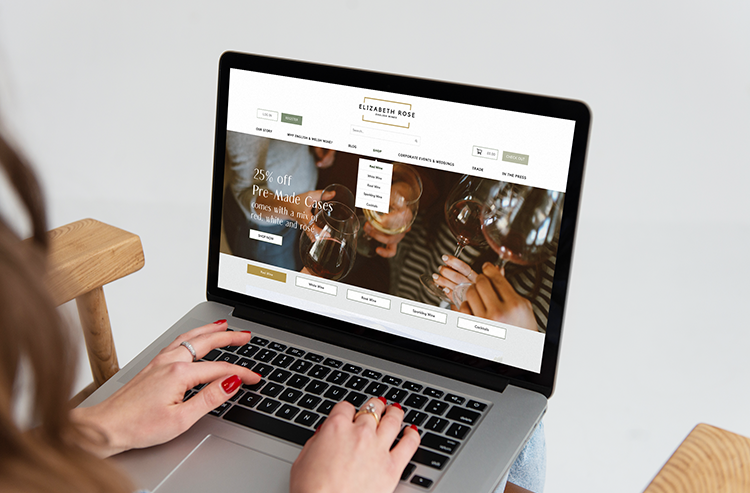
Website Design
We’ll work closely together and align your business goals to outstanding designs that stand out from the crowd.

Branding
Let me sculpt your brand identity into a masterpiece, crafting visuals that resonate with your audience and leave a lasting imprint on their minds.